7 Beauteous Blooms: Spicy Brights

Spicy brights.

Anyone who read my last post on nailing a colour scheme will know it’s my phrase of the moment, but it also happens to be my favourite colour combination and my happy place, so when I saw this bridal bouquet on Green Wedding Shoes a couple of days ago I practically fainted. Or at least I definitely swooned with delight.

Flowers: Siren Floral Co // Image: Tyler Branch

Flowers: Siren Floral Co // Image: Tyler Branch

Isn’t that one of the most beautiful things you’ve ever seen? For me, I think that is verging on floral perfection. I love the dense central arrangement of roses, poppies and anenomes in luscious reds, pinks and purples, the delicately cascading greenery, the touches of peach and ivory that soften and calm, and then those two little blue cornflowers in the top corner. If I could kiss the screen I would. In fact I have. (Don’t tell anyone.)

Here are 6 more spicy bright bouquets to inspire, delight and warm the cockles on this sunny but fresh Friday…

1. Pink peonies and a vivid assortment of blooms in citrus brights; this wild and bohemian bouquet packs a pretty gorgeous punch:

2. Wowser bombowser! Oversized and abundant, this peach and red ombre concoction verges on over the top… but it is a stunning creation none-the-less:

Flowers: Jodi Duncan // Image: Stephie Photography

Flowers: Jodi Duncan // Image: Stephie Photography

3. This is sweetness and light in a bouquet. Colourful, pretty and utterly bijou (Paul’s least favourite word), I could happily look at this one all day:

4. This compact, pop art inspired number is not to my usual taste, but you can’t not admire the artistry behind it, and those yellow billy balls put a smile on my face every time I see them.

5. An assortment of roses, tulips and peonies in several shades of pinks and peach. Super luscious, super sweet and super, super pretty:

6. And last but by no means least we have a veritable feast of spicy brights featuring all my favourites: peonies, protea, astilbe, roses, daisies, billy balls and more. ‘Tis an absolute beauty and pretty much the exact bouquet I’d have at my wedding. Oh wait, it is the exact bouquet I had at my wedding! Lucky me.

So tell me readers, which of these blooms would you want to carry down the aisle if you were getting married today? Which gets your Friday vote? And are there any brides-to-be out there who will be holding their own spicy bright bouquet in the near future…?

Have a beautiful weekend all.

Sama xxx

Nailing a Colour Scheme

I love colour. LOVE IT, I tell you. Colour has the power to make us feel; be it happiness, passion, envy or calm. Colour lifts our spirits when we are down and relaxes us when we are tense. Colour gives depth, vitality and life to the every day, and if you’re not a fan of it, I’m really not sure we can be friends. Sorry.

Some of my favourite weddings are those that are not only full of colour, but have really nailed a colour scheme. And by that I don’t mean choosing hot pink waistcoats to match the hot pink bridesmaids, hot pink chair sashes, hot pink flowers and hot pink balloons. Quite the opposite in fact. I believe that some of the most stylish and creative weddings are those that manage to tell a story and evoke a mood through the use of a carefully curated palette of colour.

Take this image below:

Not only are the maids in velvet C-U-T-E, but this stylish little bridal party is rocking a colour scheme that isn’t exactly unusual, but is so perfectly curated I had to go back and study the wedding in full. The scheme consists of two lead colours of burgundy and pale pink. Then there is a ‘supporting cast’ of green (from the foliage), ivory, bluey-grey and the warmth and richness of natural wood. This palette is ever-present throughout every aspect of the wedding and the result is something that is feminine without being sugar-sweet, elegant without being stuffy, and stylish without being contrived.

It’s a beaut of a wedding.

“We didn’t have a particular colour scheme…”

I see this phrase time and time again when doing my daily blog check, and I have to admit, it’s one of my biggest bug bears. A bit like a wedding theme, I know that having a colour scheme can evoke negative connotations amongst some. But there is really nothing wrong with having a colour scheme. Colour schemes don’t have to be dated or restrictive. They can be as big or as small as you like; as random or as specific as you and your partner wish it to be. But whether your wedding is an explosion of colour or more muted and natural, I would argue that there is always a scheme of sorts, even if it’s not particularly obvious.

Take this Swedish wedding also featured on Green Wedding Shoes:

coolCollage

coolCollage2

At first glance there’s no colour scheme as such, it’s all very white and pale. But look closer and the silvery tones start to come through; of light grey and the palest blue as seen in her dress, her ring, her shoes. It’s a very ‘cool’ look overall- a colour scheme in itself- and to avoid this looking too ‘icy’ there are hints of natural, rustic warmth coming from the greenery and the vessels that are primarily gold and clay in colour. And then there are shots of black from his suit, the blackboards, and that evocative feather installation. It’s a complex scheme with a very simple overall effect, and I have no doubt that the couple made very deliberate design choices throughout their planning. It’s another beaut of a wedding that positively sings with style, originality and a distinctive (if subtle) colour scheme.

Choosing A Colour Scheme

Ok, so deciding on a colour scheme at the start of your wedding planning can be difficult, particularly if you’re not terribly creative or if you haven’t been thinking about your future wedding since you were in the womb. I think many couples start with a favourite colour, but that’s not always the key. My advice would always be to start with a mood. What kind of wedding do you want? If ‘relaxed’ and ‘fun’ are key words, then a combination of warm brights will work well. If ‘elegance’ and ‘class’ is more your bag, then a more muted palette will probably suit.

Next, take a look at your surroundings. Where is the wedding being held? Are you in a modern, white space? Are you going to be surrounded by natural, rustic materials? Or is a sumptuous, traditional banquet hall your backdrop? Think about the main spaces you will occupy throughout the day- from ceremony and mingling to dinner and dancing- and think about what colours will work within those surroundings. Do you want your colour scheme to ‘pop’ and ‘contradict’? Or ‘blend’ and ‘enhance’? Looking through a portfolio of previous weddings held at your venue (or similar) will help you determine which colour schemes get you excited and which very much don’t.

Finally pick a lead colour or two- those which you want to put your bridesmaids in perhaps, or be in your bouquet- and then think about the ‘supporting cast’ of tones and materials that will appear throughout. Rustic weddings in particular are full of natural colour, be it from the warmth of wood, the blue of the sea or the greenery of trees and foliage. These natural tones are just as important as the lead colours in the curation of a strong and consistent colour scheme.

When designing weddings for my clients, the colour scheme is one of the first things I like to tackle, and I do this by creating or sourcing a visual reference to work from. It helps to set the mood and dictates the design choices that are made as the planning progresses. Below are two colour palette references for two very different weddings that are taking place this August. The first is full of warm, summery brights to give a modern sports hall fun, vitality and life. The second is for a wedding taking place in a woodland setting. This palette is taking a leaf (boom boom) from it’s natural surroundings with lots of muted greens and blues, but there are also pops of purple and peach to add fun and warmth.

tiffcolour

Palette 1

ColourScheme

Palette 2

I’m very much looking forward to showing you how these colour schemes will be brought to life later in the year…

My final word of advice for nailing a colour scheme is to roll with it and not be too restrictive. A visual palette like the two above are merely guiding references. For many of us, the planning process will last anything from 6 months to 18, and in this time your tastes will very likely change. Whilst I wouldn’t want you to do a complete u-turn two months before your wedding date, your colour scheme will naturally evolve and that’s ok.

When I started planning my wedding way back in January 2012 (was it really that long ago?), coral and pink were my two lead colours. But as the planning progressed and my theme evolved in to some sort of Kate Spade-meets-boho glam Mexican fiesta, my palette began to broaden. Halfway through the process I decided I wanted yellow in there too, and flashes of red. At one point I considered adding splashes of light blue, but it wasn’t until the final months that burgundy entered the fray.  A shot of grown-up elegance, I think, amongst a party palette of spicy brights.

My 'Mexican- fiesta' inspired wedding

Images by Dominique Bader

When our day was featured on Rock My Wedding, the post received some amazing comments (which I will fully admit to going back and reading every time I need a bit of a lift), but the comments on colour were the ones that really resonated with me. I remember one person loving how all the colours came together and were prevalent throughout the entire wedding. Another applauded my ‘brave’ choice of spicy tones in a wedding world of dusky pinks. And in my rambling, roundabout way, I think that’s the key to nailing a colour scheme (and yes, I am totally inferring that I nailed it, I make no apologies for this extraordinary bout of arrogance): confidence and consistency.

And now it’s over to you. I’d love to know your wedding colours- past, present or future. Is your palette big or small? Random and vast or very specific? Do you agree with me that every wedding has to have some sort of loose scheme, or have I got it all wrong? I’m off work and in desperate need of social interaction so do pop on and give your tuppence worth…

Sama xxx

The Trouble With Table Linen

I suspect I’ve put a lot of people off reading today’s post with that title.

Suffice to say it’s not the most exhilarating aspect of wedding planning, the table linen. But lordy knows, it is one of the only aspects of planning so far to have completely and utterly driven me round the bend. If you follow me on Twitter you’ll likely be sick to death of hearing me go on about it (if that’s not an advertisement to click that ‘follow’ button, I don’t know what is), but if you’ll allow me- just this once- to write more than 140 characters on the subject, I promise not to mention it again. Ever.

The trouble with table linen is that there’s just no choice. Not here in the UK anyway. The choice we have is limited to your standard white or ivory, with your twenty or so ‘block’ colours and the odd gingham, tartan or leapord-print (?!) thrown in for good measure. All bound in a polyester/cotton hybrid which contains no actual ‘linen’ whatsoever. As such the ‘linen’ of choice for most brides-to-be is usually white because, well, there is no choice, and the UK companies don’t create more lines because there is no demand. It’s a vicious circle, innit?

The other trouble with table linen is that then go on Pinterest or your favourite American wedding blog, and you see the most beautifully decorated wedding tables you’ve ever seen, with unusual charger plates and gold cutlery and mismatched chairs, all aboard swathes of textured linen in beautiful grey, or gold sequins, or the perfect shade of soft peach.  Spoilt for choice those darn Americans. And they continue to rub it in our faces by taking beautiful pictures of their beautiful tables and plastering them all over the internet, whilst I’m resigned to sobbing in a corner clutching yet another lurid, fluorescent peach fabric swatch that has been sent to me. Harumph.

And then, of course, there’s the leap of faith you’re expected to take by choosing a colour from a CGI’d image on the computer screen, which then looks nothing like the tiny square of fabric that is sent to you in the post. And then trying to work out how that tiny square of fabric would actually  look when it was a much larger square (or circle) of fabric and was draped over a 6ft table.

My name is Sama, and thanks to nasty table linen, I have become a fully-fledged, bonafide, linen-obsessed moron.

White is not right (for me)

Done well, white table linen can look AWESOME. Elegant, crisp, modern, fresh and classy are just some of the ways to describe a white clothed table.

linen3

Image via Style Me Pretty

Image via Snippet & Ink

Image via Snippet & Ink

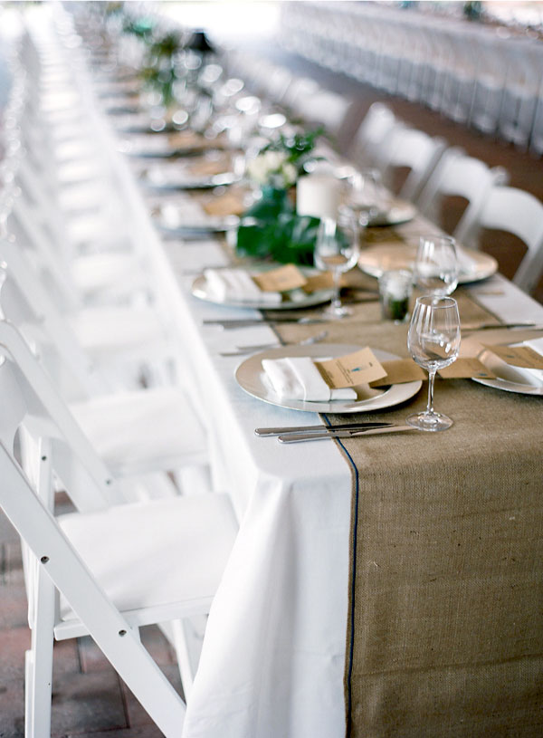
I don’t have a problem with white table linen… when it is chosen for a reason.  White is the perfect backdrop to a neutral colour scheme, or even pops of colour, and teamed with a hessian or vintage floral runner it can look trés chic. But for me, in the surroundings of an imposing, rustic, wood-built barn (like the image below), white table cloths can look a little… stark.  Simple, modern and elegant, yes. But stark. And a little cold.

The whole point of my wedding (er, other than the getting married bit) is that I want it to be warm and full of life; a veritable feast of colourful blooms, mis-matched table runners, festoon lighting, paper lanterns, streamers galore and quirky bits and bobs. White just ain’t gonna cut the mustard.  I need something that’s going to blend in to the surroundings; be the perfect, subtle backdrop; let the decor do the talking.

My Peachy Dream

Image via Martha Stewart Weddings

Image via Martha Stewart Weddings

Not only is peach the perfect, summery compliment to the coral and gold accents I plan to incorporate, but it looks warm and inviting in the evening too, like the candle-lit setting above shows.

Sadly, the peach swatches I’ve been sent so far have been a bit more like this:

Argh!

Argh!

Blend beautifully with these very blog pages, don’t they??

But whilst I am a big fan of peach (obviously), and I know they wouldn’t look quite so lurid when dressed (see candle-lit image above), I think I’m after something even more subtle still.  Something a bit more… natural.

Linen, the way nature intended it…

Natural linens are the epitome of rustic elegance I think.  Neutral and classy, they provide both subtle warmth and texture, which, in my humble opinion, makes a table so much more interesting to look at.

And just look at how these tones of sand/taupe/grey/mushroom let the spicier colours shine!

natural2

Image via 100 Layer Cake

http://joielala.com

Image via Pinterest

natural4

Image via Style Me Pretty

It took me- quite literally- an entire day of trawling through Pinterest, Google Images and linen hire websites, but I think I’ve finally identified that natural linen is going to be the best compliment to the colourful blooms, glittery jars and mis-matched table runners my Deputy Wedding Planner (my Mum) and I have been working on for the last however many months.  I’ve already received a nice swatch selection from one company, and have a few more to receive still before making the final decision and TICKING THE DAMN THING OFF THE LIST.

The bad news for natural linen lovers is that it is more expensive than it’s white/coloured/poly-cotton competitors. But if you have a reasonable portion of your budget assigned to décor and styling, or if you do  manage to make savings elsewhere (erm, like the £15 shoes I just bought! More on those next week…), then I implore you to think outside the white box and explore the many other table linen avenues. The more demand there is, the more competitive rates will become.

For those wondering which UK companies I’ve found, they are as follows:

Northfields– London based, wide range including four natural linens. Prices seem reasonable (though more expensive than non-natural).

88 Events Company– Their depot is in Glasgow but they deliver nationwide. Huge selection but their natural linens are extortionate.

Options Hire– London based again. I’m awaiting delivery of their grey flax and thatch linen swatches. A really nice touch is that they provide images of fully-laid, themed tables which then detail exactly what products they’ve used. Much more useful than a colour close-up!

Just 4 Linen– Deliver throughout the south-east. No ‘natural linens’ as such but some of their Indian Cotton range has potential.

I think I need a lie-down after that. Well done if you’ve stayed with me for the whole post- I know ‘linen’ isn’t exactly the most thrilling of blog rides, but I hope it provided some interest for those considering doing something different.

Anyone else in to the natural look? Or going bold or bright? Know of any UK company recommendations that I’ve missed out??

Have wonderful weekends one and all, and I’ll see you next week! One word: Miu-Who..?

Sama xxx

The Ingeniously Entitled ‘Table Numbers’

Well, what would you call a post that is dedicated to that oh-so exciting wedding detail, the humble table number?

Now I’m not ashamed to say that I do actually find this smallest of décor decisions pretty exciting. I mean, come on. We’re talking numbers… for the tables! Yeah yeah ok, table numbers are pretty dull and let’s face it, deeply unimportant when it comes to the epicness that is your Wedding Day, but if you (like me) are a ‘details’ person, then choosing how to differentiate your tables can be really rather fun.

Names or Numbers?

So I guess the first decision that has to be made is whether to name or number your beautiful tables?  I do enjoy a humorous and creative set of names, but for Paul and I there was nothing obvious to choose from.  Neither of us are particularly well-travelled so although it would have been quite funny to have our tables named after the glamorous towns of Colchester and Hull, I’m not sure if our guests would find our travel history less funny and more pitiful.  I also toyed with the idea of nicknames (we’ve racked up quite a few in the last seven years) but sometimes these sort of things are best kept private.  I once revealed to friends that Paul liked to call me the rather bizarre name of Bubba Squat Lobster, and now it’s rather unfortunately stuck. With a very unflattering mime impression to boot.

So we shall be sticking to numbers.  Numbers are classic, simple and much more aesthetically-pleasing.  Numbers can be big or small, subtle or bold, glittery or floral; the possibilities are literally endless.

But this is an inspiration post after all, so I’ve rounded up a few of my favourite ways to make the humble table number sexier than you ever knew it could be. Here goes…

Show me the pretty!

One of the cheapest ways to display your table numbers is to use the vessels that are already a part of your centrepieces. So stencilling the  numbers on to glass jars, printing out labels for your wine bottles or simply writing the number on to your jugs and pots using a suitable pen- as these images show. (The 2BSquared link has some handy hints as well!)

Image via 2BSQUARED

Image via 2BSQUARED

Freestanding numbers are also a really stylish way to number your tables.  You can buy paper maché numbers from most craft stores now and decorate them as you wish, like these numbers covered in glitter…

…or comic book paper!

For more rustic settings wooden blocks work well (you can make your own or buy from Etsy)…

Image via Cavallo Point

Image via Cavallo Point

…or how about using old metal door numbers? Stylish and simple.

Image via One Wed

Image via One Wed

Picture frames provide a whole host of table number possibilities, as these images show:

Image via Wedding Bee

Image via Wedding Bee

And I love how this couple used fun photographs of themselves to add personality to their table displays:

Finally, think outside the box and get crafty.  Displays like these would certainly take a considerable amount of time and effort, but they get top marks for creativity!

The most BANG for my buck

‘So what are your table numbers like?’, I hear you cry.  (I don’t really, but for the benefit of this post I’ll pretend I do.) Well, as the day draws nearer I am finding myself becoming more conscious of my ever-diminishing budget, so I wanted to keep this detail as cheap as possible whilst still having a creative impact.  For a while I envisaged vintage metal door numbers salvaged from scrap yards and boot fairs and dipped in glitter… but in reality that was going to take way too much dollar, effort and eBay was proving too hit and miss.

In the end inspiration struck on a trip to Hobbycraft immediately after Christmas.  The papier maché aisle beckoned and I found myself snapping up 11 mini hanging picture frames and a can of chalkboard spray for the princely sum of £12.49.

The frames as I bought them- Image via Giggle Squiggle

The frames as I bought them- Image via Giggle Squiggle

Last Friday I was in a particularly productive post-Christmas mood so I braved the cold and gave them several coats of chalkboard paint before using a chalk paint pen to draw in the numbers.

I wanted it to look a bit like the writing you’d see on a pub chalkboard so I found a suitable font on t’internet and practised first of all with a calligraphy pen and sketch pad before having a go with the real thing.

The nib on the chalk pen was a lot wider than my calligraphy pen so the end result wasn’t quite as clean and defined as I would have liked… but I’m still pretty chuffed with the finished product.

What do you think?

My pub-style rustic table numbers.

My pub-style rustic table numbers.

The beer bottles are from a local restaurant which we have frequented far too often in the last couple of months (that’s only half of my stash!) and will contain flowers on the day, along with the glitter jars from this post– resulting in (what I hope will be) an eclectic mix of rustic-glam centre pieces and vibrantly-coloured blooms.

You like? (Please say yes.)

I’d love to know how you’re numbering/naming (or indeed how you numbered/named) your tables, so do share!

Sama xxx

My Fantasy Winter Wedding

Getting married in the spring or summer was a no-brainer for me.  Inspired by the US blogs I have always envisioned a wedding with lots of sunshine, beautiful countryside views, festoon lighting and colour galore… which is exactly the kind of wedding I’m in the throes of planning right now (ahem- we’re keeping our fingers crossed for the sunshine).  Having said that, there is something incredibly magical about having a winter wedding, and as I start to think about getting my house ready for Christmas (the tree is going up on Friday, we seem to be behind the rest of the country), I’ve also been thinking about what our wedding would be like if it was taking place around now…

THE VENUE

The first thing to change would be the venue.  When I went to view The Great Barn in January this year it was in a bit of a sorry state.  The orchard was sparse and bare, the barn itself utterly freezing, and it’s location in the middle of nowhere was really pretty bleak.  To me, as I looked around the empty space (teeth chattering), I envisaged colour and life and a warm, sunny day, and indeed when I went back in May it was a completely different place.

No, for a winter wedding, I would put myself in a building a little more structurally sound and suited to the winter months. I see stone walls and log fires.  Candlelight in every nook and cranny and a place that guests would enter and immediately feel warm, both inside and out!  I’m gonna put it out there, I’d have my winter wedding in a pub, god damnit. A beautiful, old, cosy pub where I know we’d be well-fed, well-watered, and we could boogie long past midnight.

In fact, I’d tell you exactly what I’d do.  I’d stay a lot closer to home than the depths of Kent.  I’d have the ceremony at the beautiful Rangers House in Blackheath (or something similar), before walking through Greenwich Park for some awesome dusk pictures and winding up in the intimate and history-steeped Davy’s Wine Vaults for the evening festivities.  I’ve seen this particular combination done several times in the wedding world and I get a wave of jealously every time.

A snowy scene in Greenwich Park- image by Rik Pennington

A snowy scene in Greenwich Park- image by Rik Pennington

greenwich1

(An autumn wedding but we’ll ignore that.) Enjoying the last rays of the sun in Greenwich Park- image by Rik Pennington

davys2

Inside Davy’s Wine Vaults- image by Rik Pennington

davys3

Inside Davy’s Wine Vaults- image by Rik Pennington

Davy's Wine Vaults- Image by Caught the Light

Let there be light! A Davy’s Wine Vaults wedding by Caught the Light

THE STYLING

This part is hard because there really are SO many options for a winter wedding.  What I do know is that the festoon lighting would be replaced with fairy lights and candles galore.  And as I love colour so much I think I would move away from the summery tones of coral, yellow and pinks that I’m using for my late May wedding, and adopt a more jewel-inspired hue: ruby reds and sapphire blue, amythest, pink and of course lots and lots of gold and silver sparkle.  All set on an earthy, rustic backdrop of wood and stone.

jewelwed1

Love the combination of colours in this gorgeous Smog Shoppe wedding– Image by James Moes

jewelwed2

Everything about this makes me happy- Image by James Moes

Gold place settings on navy sequinned linen, people! Glorious, magical image via Sceme Events

Gold place settings on navy sequinned linen, people! Glorious, magical image via Scheme Events

THE FASHION

You know what I’ve always wanted to go to?  A black-tie wedding.  And a winter wedding is just crying out for über-glam attire in my humble opinion.  Even more so when the ‘do’ is taking place in the less glamorous setting of an intimate London pub.  Why the hell not?  Electic-chic is the way forward, ladies and gentlemen.

This couple did it (from the Smog Shoppe wedding I mentioned earlier) and they looked fab.

For myself, I think I’d be torn between wanting something quite ice queen and wintery, or shaking things up a bit and going glamorous and gold.  Either way these dresses would require my urgent attention…

Estella by Alice Temperley is the perfect winter wedding dress.

Estella by Alice Temperley is the perfect winter wedding dress with it’s long sleeves and intricate lace back.

Stunning bride alert! Image by Love Katie + Sarah via Ruffled...

Stunning bride alert! Image by Love Katie + Sarah via Ruffled, dress designed by the bride…

golddress2

…And it works so well with a groom in black tie. Image by Love Katie + Sarah

So there we have it.  A brief delve in to the kind of wedding I’d be planning if I could have two. (Are you sure I can’t? We should all be allowed to do it twice, right?).  I’m dreaming of a rich, jewel-toned wedding in a south-east London pub full of candle light and sparkle.  Not so  different to the bright, colourful wedding in a Kentish barn full of festoon lighting and sparkle that I’m actually planning, I suppose… Same same but different, as they say in Thailand.

What would you do if you could do it twice?

Sama xxx


Theming Your Wedding: Don’t Be A Hater

I’m going to tell it to you straight, brides of Britain.

Your wedding has a theme.

My wedding has a theme.

Every wedding has a theme.

Theme, theme, theme, theme, theme.

(Am I mentioning the word ‘theme’ enough?)

Working in a bridal boutique and chatting with brides-to-be on a daily basis, I’ve come to realise that a lot of brides have two major misconceptions.  The first is that they don’t have a budget for their wedding dress (sorry ladies, but this is simply not true). The second is that to theme your wedding is an unfortunate decision left to Sci-fi geeks and Disney fans only, and therefore deeply cheesy/contrived/uncool.  Those that do admit to having a “loose theme” put quotation marks around it and grimace apologetically.

Now excuuuuuse me, but since when have we become a nation of haters??

My argument today is not that you should theme your wedding; my point is that, like it or not, your wedding will have a theme, however loose, and identifying said theme in the early stages of planning will help you to create a truly stylish, personal and memorable day.

Bold statement? Let me continue…

There are many definitions of the word ‘theme’, but the most relevant when it comes to weddings is:

2. a unifying or dominant idea, motif etc. (from Dictionary.com)

A unifying or dominant idea. As simple as that.  You can replace the word ‘idea’ with ‘look’, ‘style’, ‘aesthetic’ or ‘vibe’ and you still have the basis of a theme.

It can be as bold and clear-cut as this kitsch and colourful Superhero-themed wedding from Green Wedding Shoes

(This wedding is sheer joy. To appreciate in full click here.)

… Or your choice of venue and attire can simply evoke an era, like this ever-so-subtle but oh-so-elegant 1920’s inspired wedding from Love My Dress:

What I particularly love about this wedding is how the era of the 1920’s is merely a suggestion.  There is consistency in the 20’s styling (her headpiece and his dinner suit combined with the grandeur and elegance of the setting and flower arrangements), and yet we get hints of other eras too- her bridesmaids are pretty in 60’s pink, and there are modern-day touches as well, with the bride’s snakeskin Jimmy Choos and white Kooples blazer. (Click here to see this stylish wedding in full.)

A myriad of styles can still a theme make.  Fact.

I suppose this post has come about following a series of frustrating bridal appointments in the boutique.  Not frustrating for me, but frustrating for those ladies who haven’t identified a theme/vision/aesthetic for their day and are therefore finding the dress-buying process inconceivably difficult.  How do you choose if you’re one of those lucky ladies (I most definitely wasn’t) who suits most shapes and styles and feels just as special in a structured, lace fishtail as you do in a floaty Jenny Packham?  Well, it comes down to how you want to feel on the day, and, I think, how the qualities or the ‘theme’ of the dress fits in with the qualities and overall ‘theme’ of the wedding.

Take this recent wedding from London Bride.  Charley (the blogger/stylist behind London Bride) sums the wedding up perfectly with the title: A Feast Full of Fun In Just 4 Months. And what a feast it is.

Photography by James Melia

Photography by James Melia

Photography by James Melia

Photography by James Melia

Photography by James Melia

Laura’s dress is a 1930’s number from The Vintage Wedding Dress Company, chosen, she says, because ‘I didn’t want to feel ‘trussed-up’- I wanted something I could move, eat and dance in’.  And likewise, the wedding itself is a very relaxed affair, with lots of moving, eating and dancing.  Stylistically there are hundreds of elements- it’s a little bit bohemian, a little bit funky and a little bit London.  The bride and groom are dressed with the 1930’s in mind, décor is simple and rustic, tattoo favours went down a treat and the colourful, wild array of blooms were arranged by the bridal party.

Eclectic and mismatched with a large colour palette… it’s a theme, kids, whether you like it or not.  I have no idea whether this couple would have admitted they had a ‘theme’, but the way Laura talks us through her style choices indicates she had a clear vision and concept for the day, resulting in the fun, unique and stylish wedding we are lucky enough to ogle over now.

So what do you think?  Do you agree that every wedding has some sort of theme, be it loose and suggestive, or bold and clear-cut?  Or do you think it’s possible to have a completely theme-free day??

And what is or was your wedding theme? If you haven’t thought about it before, think about it now.  It’ll help with all future wedding-related decisions, I promise.

The shortened version of mine is boho-glam.  The full version would be something like colourful, eclectic fiesta meets bohemian romance with a whole lotta glitter and not a sombrero in sight.  Or something like that.

You?

Sama xxx

The Ceremony Backdrop

Last Friday I popped down to the venue to talk festoon lighting with a production company.  As always, it was lovely to be in the barn and I’m confident that all the styling ideas currently floating around my head and on various bits of scrap paper around the house are going to look fab.  However, my visit was a reminder that when it comes to the ceremony backdrop, I’m still a little stuck.

We are essentially getting married against a wooden wall.  A very beautiful wooden wall, but a wooden wall nonetheless.  As a fledgling wedding planner and stylist, the aesthetics are very important to me so I’m keen to make something beautiful and unique that a) will look fabulous in the photos and b) make saying those all-important vows seem even more momentous. (Attention-seeker? Moi? I’d like to say an Old Romantic…)

The aforementioned wooden wall.

The picture above is from a venue visit that took place back in May, so ignore the gazebos, but where my Mum is standing is pretty much where Paul will be.  And I will be opposite him.  The Great Barn has fantastic height so my instinct is to create something that hangs from that second beam, level with the chandelier in the picture.  But what exactly? Now that is a good question…

Petal Power

I love flowers.  And I have said before that I want them everywhere at the wedding.  A hanging floral backdrop is simple, rustic and ever so sweet… but could also be pretty expensive.  And a little bit time consuming to put together the day before.  So pretty though!

Image by Chantel Marie Photography via Style Me Pretty

Let There Be Light

Light is magical.  I’m hoping that saying my vows to the man I love is going to be magical. Light and love and magic.  Sounds like a pretty damn perfect ceremony to me.

Ribbons & Streamers

Of all the types of backdrop you can make, hanging ribbons or streamers from a pole is probably the easiest to do.  Choosing a beautiful colour palette or even adding a touch of sparkle can make it personal to you and your wedding.  I’ll need a huge amount of ribbon to reach the floor at my venue, but I’m thoroughly tempted…

Image by Meg Perotti via Ruffled

Swathes of Fabric

There’s something about the word ‘swathe’ that gets me going. Soft and luxurious and all-encompassing, I think some simple folds of hanging fabric can create the most evocative of backdrops. Here are some of my favourites, ranging from an art installation, to two simple swags:

Best of the Rest

The wedding industry is positively over-flowing with talented, creative folk, so from kooky to crafty you can find all kinds of backdrop wonders on t’interweb. A bit like the paper cranes I’ve cooed over before, I think some of these might be a little too quirky for Paul and I, but I applaud these creative cats nonetheless:

Image via Lil’ Sugar

But by far the image that gets my heart racing the most is this beautiful creation below that combines a bit of everything; fabric, ribbon, layers and light- all set against a rustic brick background.

Image by Tec Petaja via Once Wed

My mind boggles at how this was put together, and more surprisingly (as you can’t really tell from this image), it’s actually a chuppah– so the bride and groom can stand underneath it rather than just in front.  How incredibly romantic is that??

So folks, which of these float your boat?  And which of these many beauties shall I try to recreate for my own wooden wall??

Hmmm… *scratches chin thoughtfully*… we shall just have to wait and see.

Sama xxx

Pimp My Jars: Spray Paint and Glittery Goodness

Well hello there!

Ahh, the last bank holiday of the summer is over- sob! I do hope you all did lovely things.  I spent the weekend in Oxford for my step-sister’s wedding (remember this engagement shoot from a few months ago?).  Twas a wonderful day with the only rain falling pouring just before the ceremony was due to begin.  I shall be bringing you a full report when the professional photos are ready, don’t you worry.

In the meantime I spent yesterday getting my craft on with the help of my bridesmaid, Nicola.  First and foremost this is NOT a How To post-  a) I didn’t take enough pictures, and b) the finished products didn’t turn out quite as ‘polished’ as I would have liked…

But here’s a list of what I used anyway:

  • Martha Stewart Glitter Acylic Craft paint (recommended by Something Turquoise and ordered online)
  • Martha Stewart pouncers (the little spongey things- also bought online)
  • Plasti-Kote Enamel Spray Paint in Glitter Gold and Matte Black (from Hobbycraft)
  • Stencil tape
  • A paint tray
  • Gold leaves (also from Hobbycraft but not used because I forgot to buy the gilding paste!)

The Inspiration:

I was using several images from t’internet as my inspiration.  First up I loved what Jen from Something Turquoise had done to these champagne flutes, and secondly the combination of black, gold and wood was turning me on from this New Years Eve Inspiration shoot as seen on The Sweetest Occasion.

Swoon! Enjoy those images above as it gets a little less professional from here…

My finished pimped glass collection:

1. I love the ‘dipped’ look of those champagne flutes so these block colour jars were my attempts at something similar.  They actually turned out pretty well, although you have to allow time for the glitter paint to dry in between coats as the glue is white when it first goes on which can be a bit misleading!

2. Holy Moly, is it Gay Pride? No it’s just Nicola and I getting creative.  The trick here (as well as allowing drying time between coats) is to apply your stencil tape very carefully making sure the tape is thoroughly stuck down to stop any paint slipping underneath! As happened to me several times.  Nicola was much more renegade than me and didn’t bother with stencil tape at all, although they still turned out pretty good.

3. … And I think my favourite pieces of the day- the glittery black bottles.  Whether these will hold the table numbers or a big old hydrangea head I’m not quite sure, but there will definitely be one on each table.  (And will tie in with the black chiavari chairs I’ve ordered.)

So, three hours and a lot of fun later, my glass collection has gone from this…

… to this:

Colourful, sparkly and completely camp but I love them.  Whether the whole collection will be used I don’t yet know, but with flowers in and in such rustic surroundings I think hope they will work.

What do you think? Which is your favourite?

Sama xxx


Are You Being Served?

At risk of sounding like a pair of alcoholics, Paul and I like a drink.  We don’t tend to drink during the week, but we do associate alcohol with having a good time, and some of my favourite ‘us’ moments are when we’ve had a drink in hand: a bath-time proposal whilst supping champagne, watching comets shoot across the sky whilst enjoying a late night beer on holiday in France, drinking with friends round a camp fire, saying ‘I love you’ to each other for the first time in the corner of a pub… (and again the following morning when sober, thankfully).

As such the drinks are an important aspect of our wedding.  With no licence to sell alcohol at our barn venue, we will be providing all the booze, and I’m particularly looking forward to taking a couple of trips across the water to Calais to stock up.

So today I thought I’d share some images and ideas of what we plan to serve and how we plan to serve it.  Well, it is Friday after all.

The Post-Ceremony Drinks

Tradition says champagne, I say Cava or Prosecco (both of which I prefer and are cheaper) served with a dash of my Mum’s home-made damson gin. This I will leave for the catering staff to pour and serve, but there will also be a self-service Corona and soft drink station for those who prefer their drinks a little more hoppy or… soft.  I’ve seen some pretty awesome drinks vessels from around the wedding world so far…

Beer in a boat, anyone?
(Image via Oh Lovely Day)

Or how about that rusty old bath tub you’ve got lying around out back?
(Image via Oh Lovely Day)

… but by far my favourite is the humble wheel barrow. Rustic, portable, suitable for a Kentish orchard…and a bit easier to get hold of than a bath. Or a boat.

To accompany dinner…

With food we will of course serve wine, as standard. Wine is my tipple of choice, and although I can drink it by the gallon, I’m not exactly what you’d call a connoisseur.   I was planning on sourcing, taste-testing (any excuse) and serving a nice Sauvignon Blanc for the white wine drinkers, and a hearty Rioja for the red, but then my Mum went on holiday to the south of France and came back with 35 bottles of a white wine I’ve never heard of but tastes really rather good.  Unfortunately it is unlikely that we’ll find this particular wine again in Calais, but it will be wonderful with dinner.

*On a side note, I’ve heard that you should serve your best and fullest-flavoured wines with food.  They are sipped rather than guzzled then, and your supplies will go further!*

Party time!

Of course, it is after dinner that people will really start to let their hair down, and our evening guests will arrive looking for a pardy and a well-stocked bar.

In terms of what we serve we will be keeping it simple: a choice of red or white wine, a lager and a Kentish ale, and soft drinks for those being boring sensible.  Spirits are too fiddly and too expensive but I’m toying with the idea of having a pre-mixed signature cocktail for those who don’t like wine or beer.  I know that Paul and I will have a lot of fun choosing a suitably naughty name…

I’m putting P in charge of stocking the bar and making sure we have enough.  I have a history of under-estimating how much we need when it comes to buying food or drink for parties, and this is one party where we cannot run dry.  But when it comes to making the bar look pretty… this, of course, will be my domain.

Like chair covers, I have a hatred for drinks bars which are essentially a tablecloth-covered trestle table.  They do, of course, serve their purpose and they’re cheap, but they are also boring, unimaginative and completely devoid of personality or style.

No, I like my bars high and made of wood.  And decorated with funky menus and neon signs and quirky bits and pieces.

Like this bar, first spotted on Green Wedding Shoes and immediately drooled over and pinned…

Or this bar in all it’s rustic, wooden glory…

These guys have got their funky signage and signature cocktails down to a tee…

…Whilst this giant bar sign makes my heart a flutter (and ensures that no-one gets lost).

But it is this handsome bar that wins today’s prize, made especially for the wedding by the groom:

Turns out that she is a well-know movie star and he is a celebrity carpenter, which probably made the construction and access to materials a little easier, but a sterling effort none-the-less.

So what do you do if you’re allergic to trestle tables but aren’t marrying a celebrity carpenter?  Well, I have recently stumbled across a brilliant website dedicated to selling second hand bars.  In fact it doesn’t stop at bars; second hand chairs, tables, catering equipment… if you’re getting married in a dry hire venue and want to source some interesting bits, make sure you save this website to your Favourites. Pronto.

I had started to check daily for a suitable small bar that we could potentially purchase and then sell on again after the wedding, when my Mum stepped in to make a genius suggestion once again.  She is a director for her local Am-Dram group and for a recent production of ‘Allo ‘Allo, a guy from the village made a wooden bar for the show.  With it doing nothing now but sitting in someone’s barn waiting for the next production, we’re going to go and have a look at it next time I’m down to see if it would be suitable.  I will post some pictures once I’ve been, but in the meantime… score!

Anyone else bar-my about their bar area?? (Boom boom!)  Or having difficulty deciding what drinks to serve?  Would love to hear from you on this sunny Friday afternoon.

In the meantime, have wonderful weekends all and thanks for reading 🙂

Sama xxx


A Thousand Paper Cranes

Over the last couple of weeks I’ve started to see the humble paper crane take centre stage at some stunningly beautiful weddings.  Reading a little bit more in to it,  an ancient Japanese legend promises that the person who folds a thousand paper cranes is granted a wish by a crane, such as long life or recovery from an illness.

Although traditionally given as a wedding gift from the father, the couple who make a thousand cranes together can wish for a life time of happiness and prosperity… sounds pretty damn romantic to me.

And it looks pretty good too.

A riot of colour and pattern like the image above makes for a spectacular display.

But keeping it white and pure is equally as striking.

Je Mange image via Flickr

Hanging from trees they make a sweet and meaningful alternative to streamers…

…whilst an installation such as this can add drama and spectacle.

Image by Jenny Ebert Photography

And I LOVE the ombre effect of the image above.

Following this video tutorial I had a little go earlier this evening and after around 6 minutes of folding, concentrating, pausing, rewinding and “wait- I don’t understand!”-ing, I was the proud owner of this little guy:

Only another 999 to go then!

I have already run the idea past Paul and to say he’s not keen would be an understatement.  But I think I’m going to persevere with some gentle attempts at persuasion.  An ombre effect display hanging from ceiling to floor of The Great Barn would make a stunning backdrop to get married in front of.  And I love the idea of saying our vows in front of something we would have spent hours of care, patience and dedication making.  That’s what a marriage is about after all, is it not?

Anyone else thinking of tackling the Japanese legend?

Sama xxx